Responsive Design Principles for WordPress Sites
Master mobile-first strategies, testing techniques, and CSS approaches that ensure your WordPress site looks perfect on every device.
Why Responsive Design Matters
You’re building a WordPress site. The desktop version looks stunning — clean layouts, beautiful typography, perfectly spaced elements. Then someone opens it on their phone and everything breaks. Text becomes unreadable, buttons stack awkwardly, images overflow. That’s the reality without proper responsive design.
Responsive design isn’t just about making things look good on mobile. It’s about creating an experience that works seamlessly across every device, from a 320px smartphone to a 4K monitor. It’s about understanding that your visitors are on different screens, with different needs, and different expectations.


Mobile-First Design: Start Small, Think Big
Mobile-first design means you start by designing for the smallest screens first. Not as an afterthought. Not as a “mobile version.” But as your primary design starting point. Then you enhance the experience for larger screens.
The Mobile-First Mindset
- Prioritize content hierarchy — what’s essential?
- Simplify navigation and reduce clicks
- Optimize images for slower connections
- Use touch-friendly button sizes (48px minimum)
- Test on real devices, not just browser previews
Why start small? Because constraints force clarity. When you’ve got a 320px viewport, you can’t hide bad design with flashy elements. Every decision matters. Then when you expand to larger screens, you’re adding enhancements, not trying to squeeze content into awkward spaces.
Understanding Breakpoints
Breakpoints are those magical pixel widths where your design adapts. You’ve probably heard of them: 768px for tablets, 1024px for desktops. But here’s the thing — these aren’t magic numbers. They’re just starting points. Your design should break whenever it needs to, based on your actual content.
Common Breakpoints
Don’t get locked into these numbers. If your design looks broken at 850px, add a breakpoint there. Your users don’t care about standard sizes — they care that the site works on their device.

Essential CSS Techniques
Responsive design lives in your CSS. You’ve got to know the tools that make it work. Flexbox and Grid are your best friends here. They’re not optional extras — they’re foundational for creating layouts that adapt beautifully.
Flexbox Layouts
Perfect for one-dimensional layouts. Flexbox makes it easy to create flexible rows and columns that adjust based on available space. Wrap items, align them, distribute space — all with clean, readable CSS.
CSS Grid
For complex two-dimensional layouts, Grid shines. Define columns and rows, place items precisely, create responsive grids with auto-fit and auto-fill. It’s powerful and worth mastering.
Fluid Typography
Use clamp() to scale font sizes smoothly across viewports. No more jumping between breakpoints. Your text flows from mobile to desktop with natural progression.
Responsive Images
Use max-width: 100% to ensure images never overflow. Consider srcset for different resolutions. Lazy loading improves performance. Images should adapt, not break layouts.
Media Queries
These are your breakpoint triggers. Write them strategically, targeting the widths where your design actually needs adjusting. Mobile-first means your base styles apply everywhere, then you enhance.
Viewport Meta Tag
This one line controls how mobile browsers render your page. Without it, phones try to fit your desktop site into their tiny screen. With it, responsive design actually works.

Testing Your Responsive Design
You’ve built a beautiful responsive site. Now test it. Don’t rely solely on browser dev tools. Those are helpful, sure, but they’re not real devices. Real devices have different hardware, different browsers, different network speeds. You need to test on actual phones and tablets.
“The browser preview might show your site perfectly at 375px. But that’s a perfect 375px screen. A real phone has different pixel ratios, different performance characteristics, different touch behaviors. Test on the real thing.”
— Mobile Development Best Practice
Testing Checklist
- Test on actual iOS and Android devices
- Check different screen orientations (portrait and landscape)
- Verify touch interactions are accurate
- Test on slow network connections
- Validate keyboard navigation for accessibility
- Check form inputs on mobile browsers
- Test on older devices with limited resources
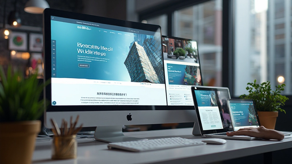
Responsive Design in WordPress
WordPress doesn’t handle responsive design automatically. You need to build it in — either through your theme or through careful customization. Here’s what you need to know.
Choose a Responsive Theme
Start with a theme that’s built for responsiveness. Look for themes that explicitly state mobile-first design, proper breakpoints, and clean CSS. This gives you a solid foundation instead of fighting against a poorly-designed base.
Customize With Care
Use custom CSS to modify your theme, not the theme files directly. Add your responsive styles in the Additional CSS section. This preserves your theme through updates and keeps your customizations separate and maintainable.
Test Images and Media
WordPress images need proper sizing. Make sure your featured images, galleries, and embedded media all scale responsively. Use WordPress’s built-in responsive image features and consider lazy loading for performance.
Optimize for Mobile Performance
Mobile users often have slower connections. Minimize CSS and JavaScript, use a caching plugin, compress images aggressively. A responsive design that’s slow is worse than no responsive design at all.
The Bottom Line
Responsive design isn’t a luxury feature anymore — it’s a requirement. Your visitors are on phones, tablets, and desktops. Your WordPress site needs to work beautifully on all of them. Start with mobile-first thinking, use modern CSS techniques like Flexbox and Grid, test on real devices, and keep performance in mind. You’ll create WordPress sites that look professional, function smoothly, and keep your visitors happy no matter what device they’re using.
The principles we’ve covered here aren’t just theory. They’re practical strategies you can implement right now in your WordPress projects. Build with responsiveness from the start, test thoroughly, and you’ll have sites that work for everyone.

Disclaimer
This article provides educational information about responsive design principles and WordPress development. The techniques and approaches described are based on current web standards and best practices. Every WordPress project is unique, and results may vary depending on your specific theme, plugins, hosting environment, and implementation details. We recommend testing thoroughly on your own setup before deploying changes to production sites. For complex projects, consider consulting with a professional WordPress developer or designer who can assess your particular needs and circumstances.